en
en  de
de it
it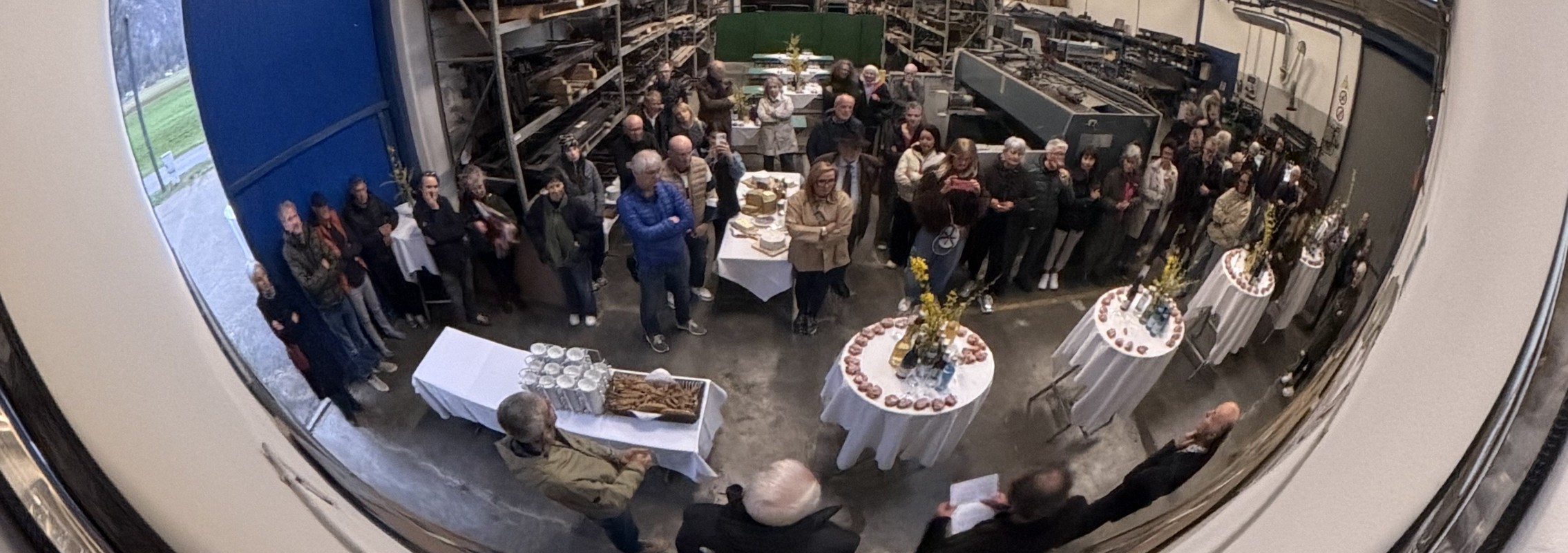
Jep
Jep
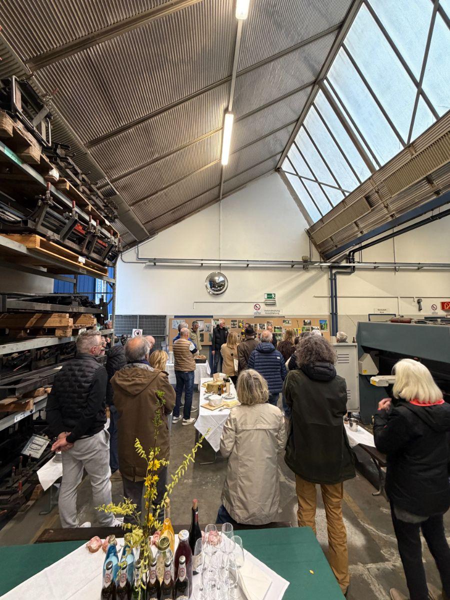
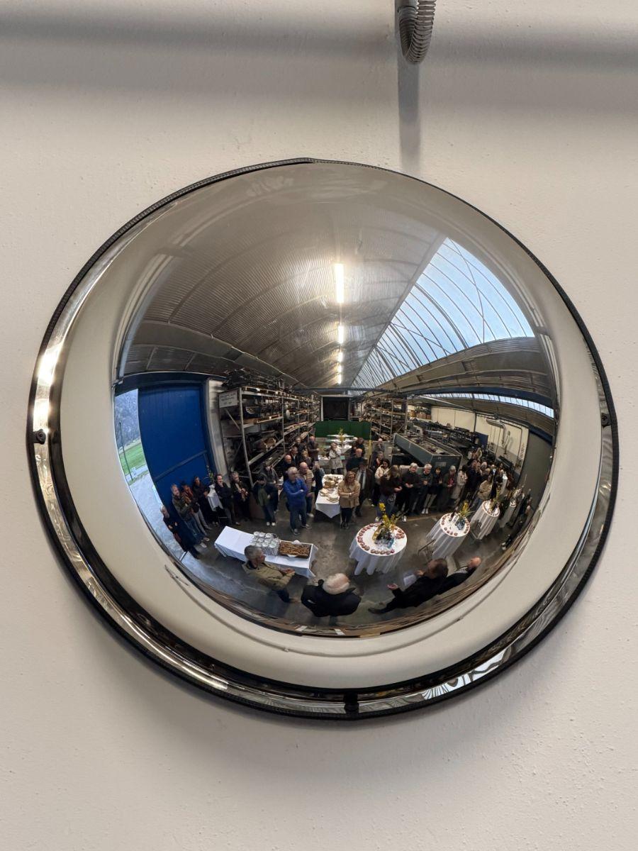
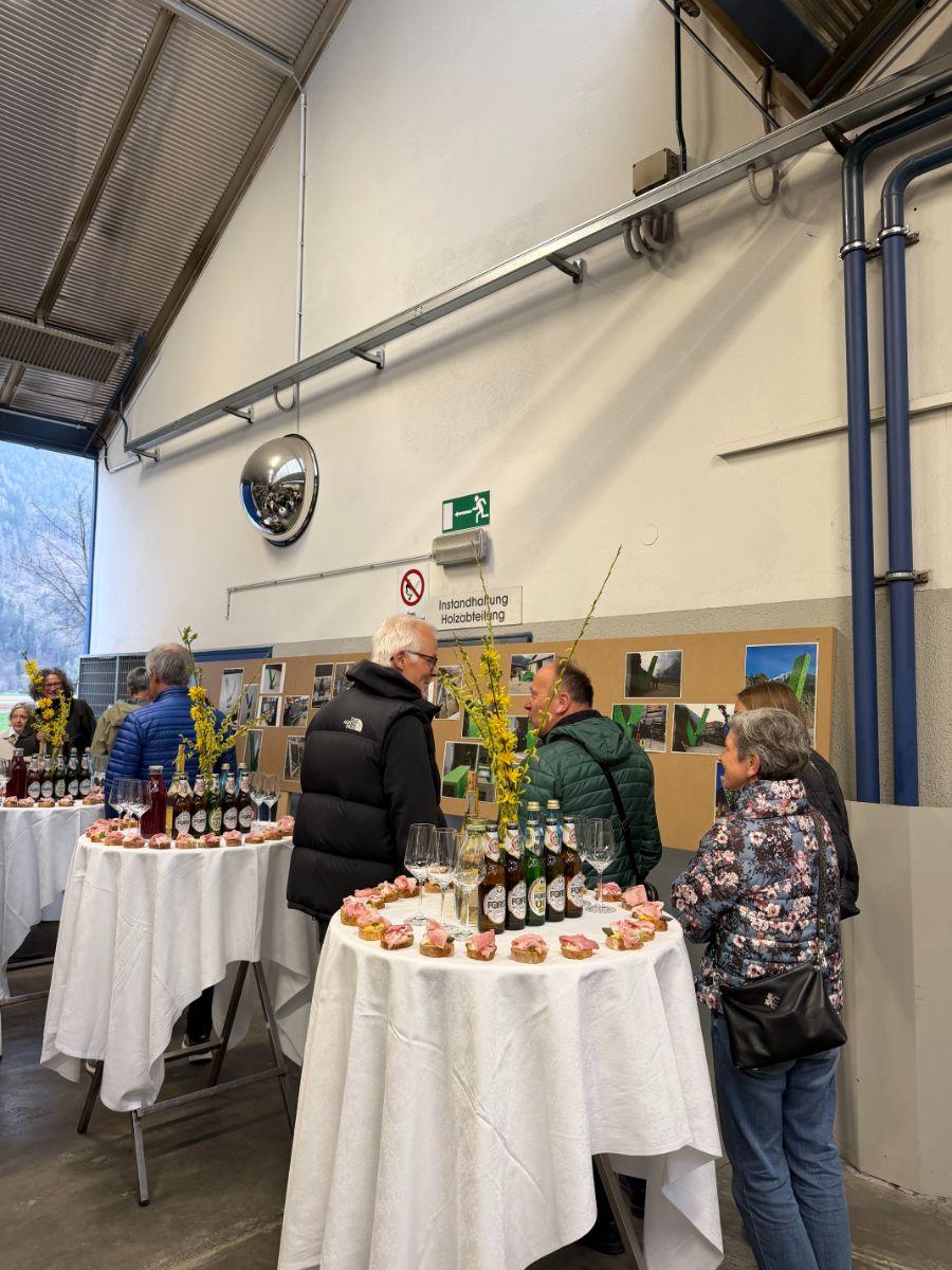
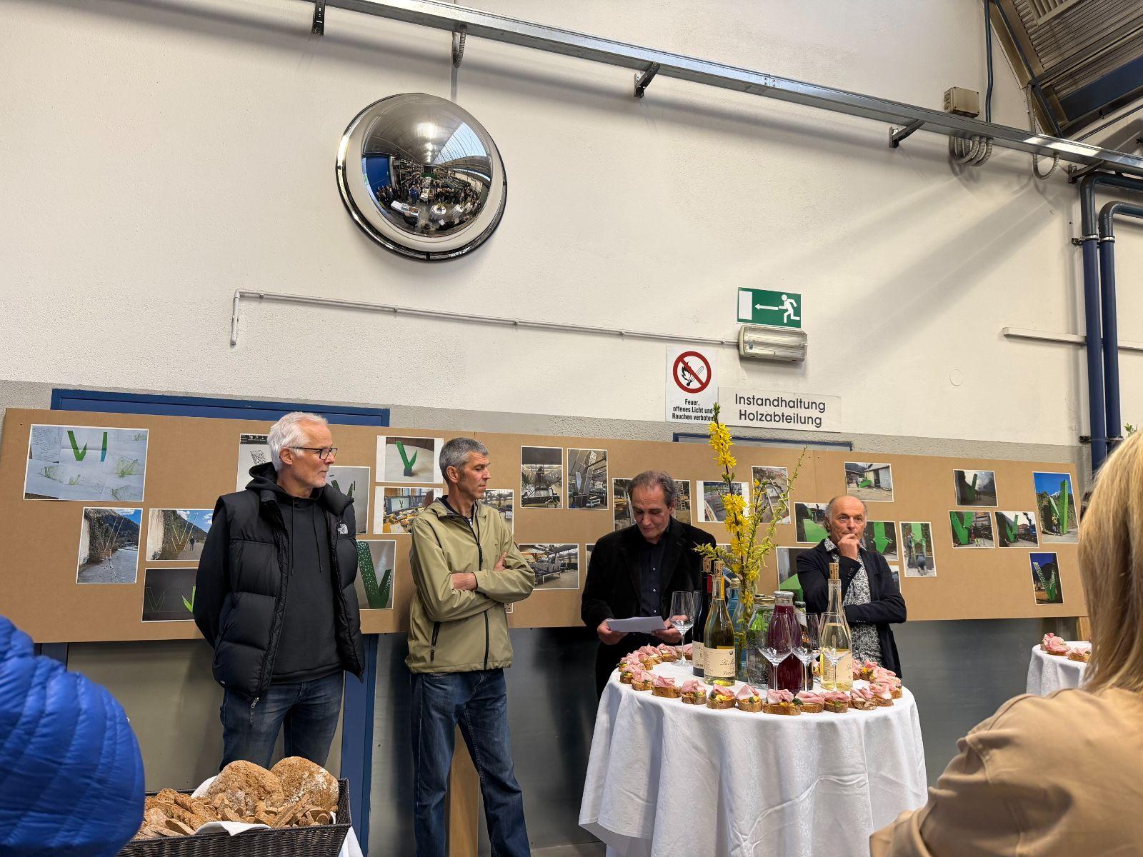
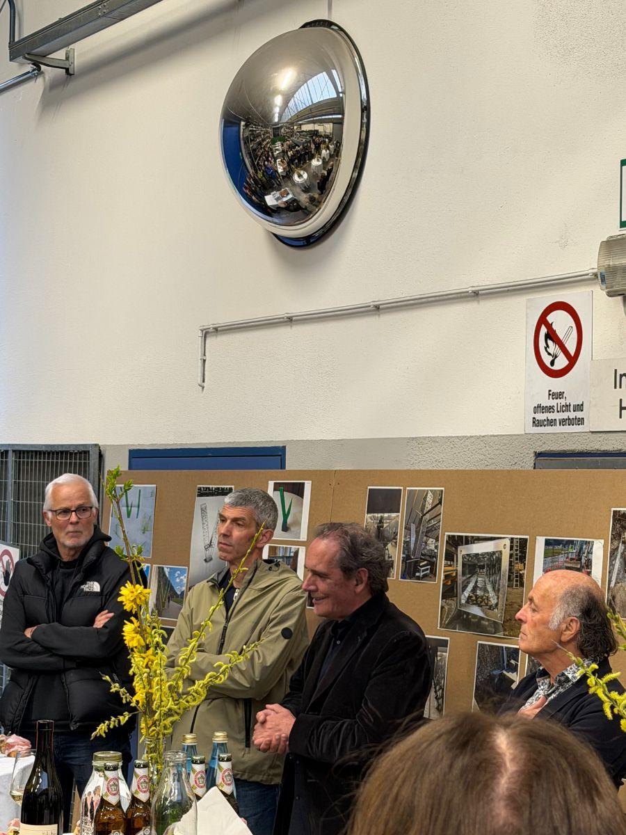
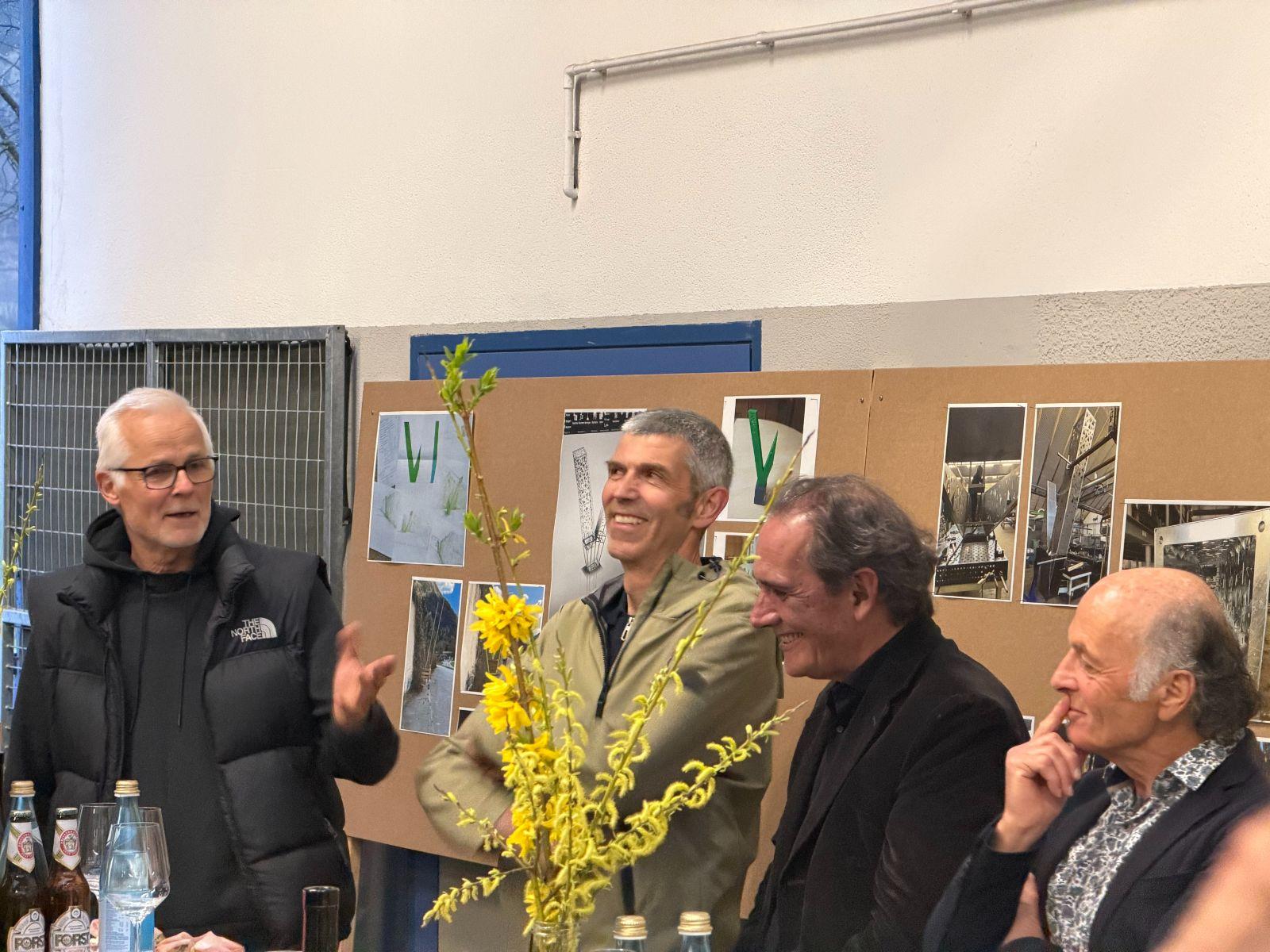
To mark its 60th anniversary, euroform w is transforming its corporate history into an impressive work of art – a symbol of identity, craftsmanship and creative vision. The contribution by Heinrich Schwazer, a renowned South Tyrolean art critic, describes the creation and significance of the metal sculpture “Jep”, created by artists Lois Steger and Paul Feichter for euroform w’s 60th anniversary in Sand in Taufers. The sculpture serves not only as a work of art but also as a visible symbol of the company’s identity and the heritage of its founding family.

Art as a Carrier of Identity
The art critic Heinrich Schwazer begins by exploring how a functional, rather anonymous industrial building can be transformed into a distinctive and memorable place. According to the author, art is the most convincing solution, as every genuine work of art is unique by definition. Euroform therefore chose not only to celebrate its anniversary, but also to make it visible through a permanent artistic landmark.
The Idea Behind the Sculpture
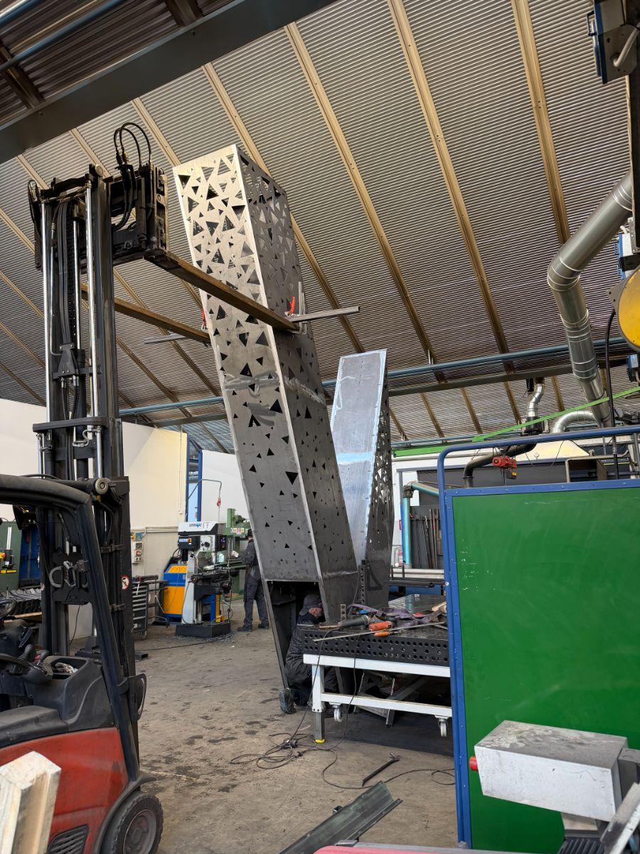
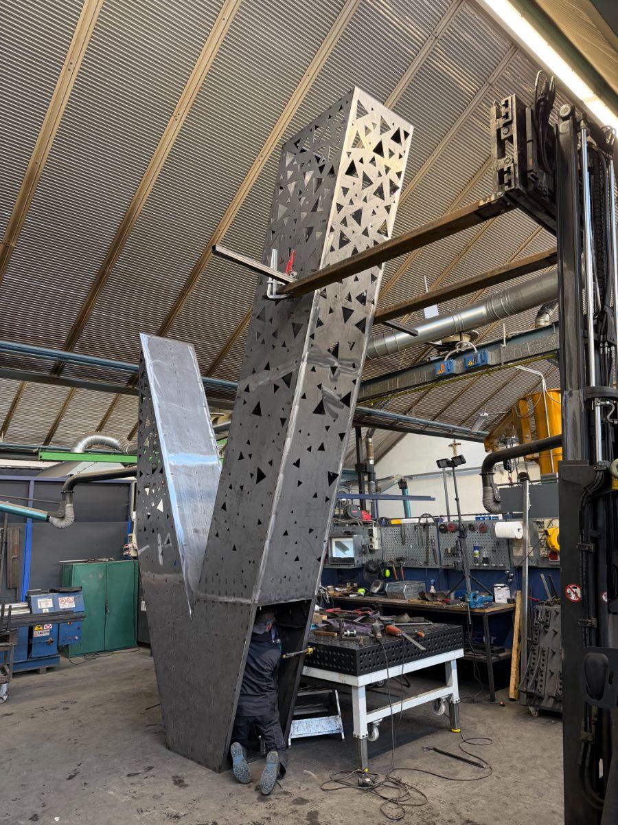
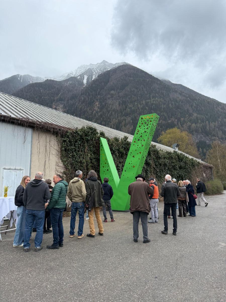
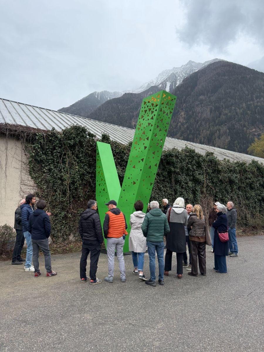
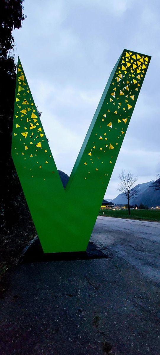
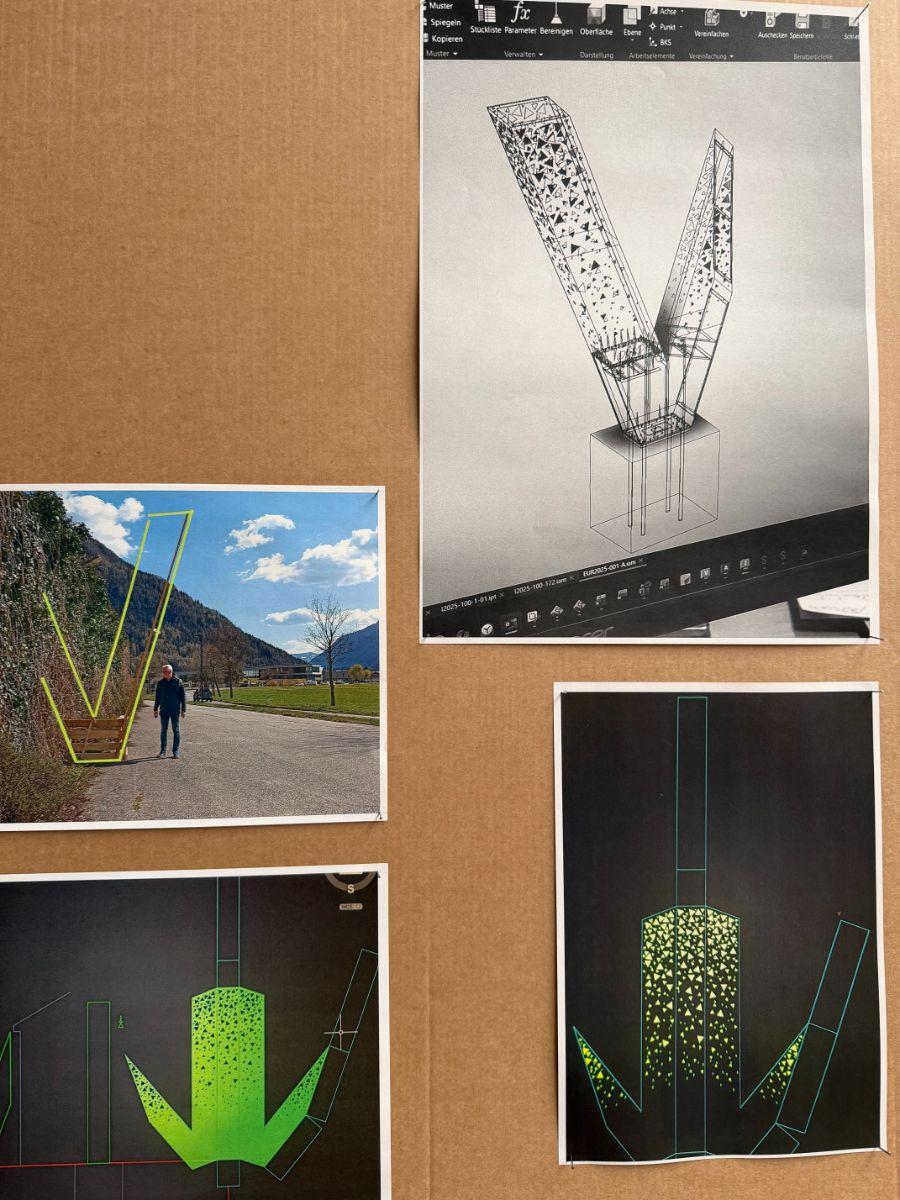
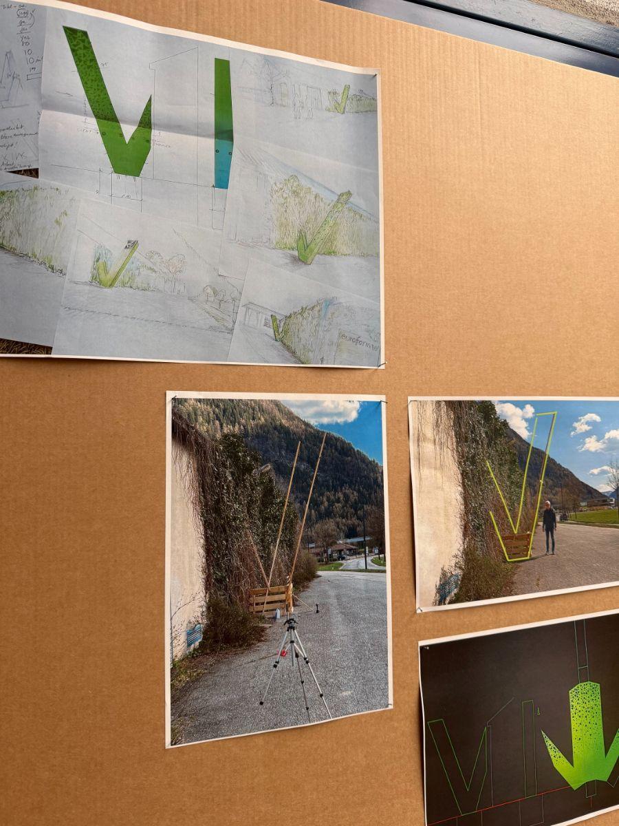
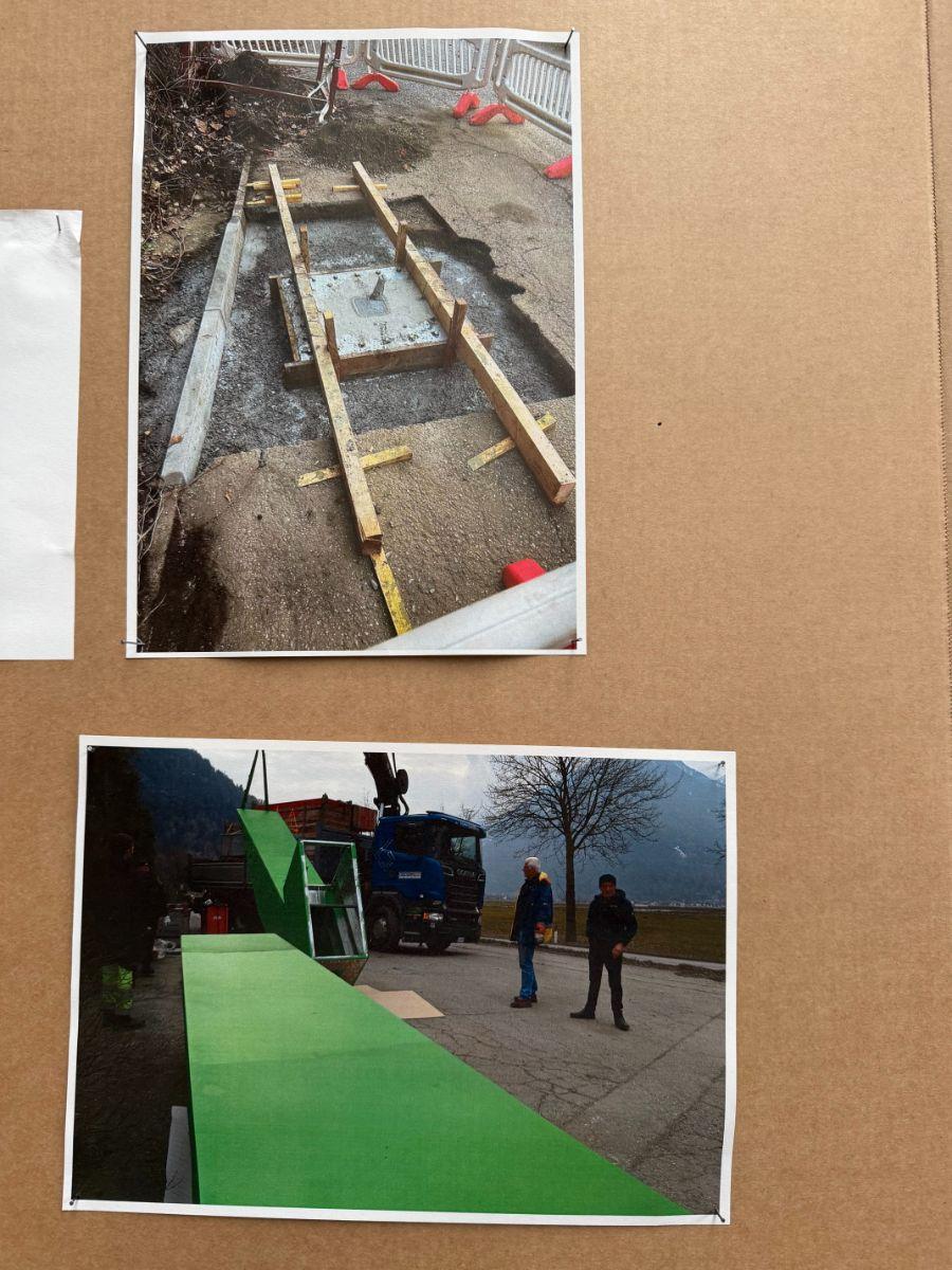
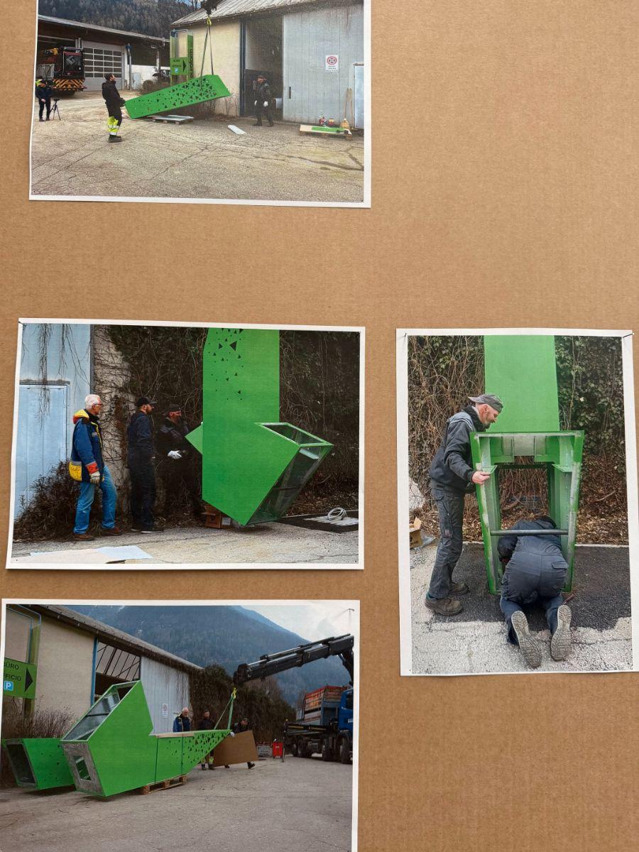
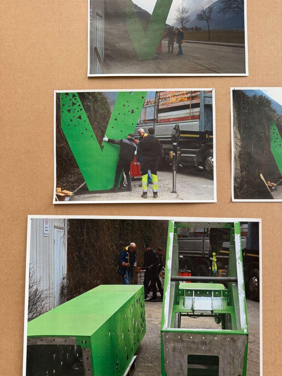
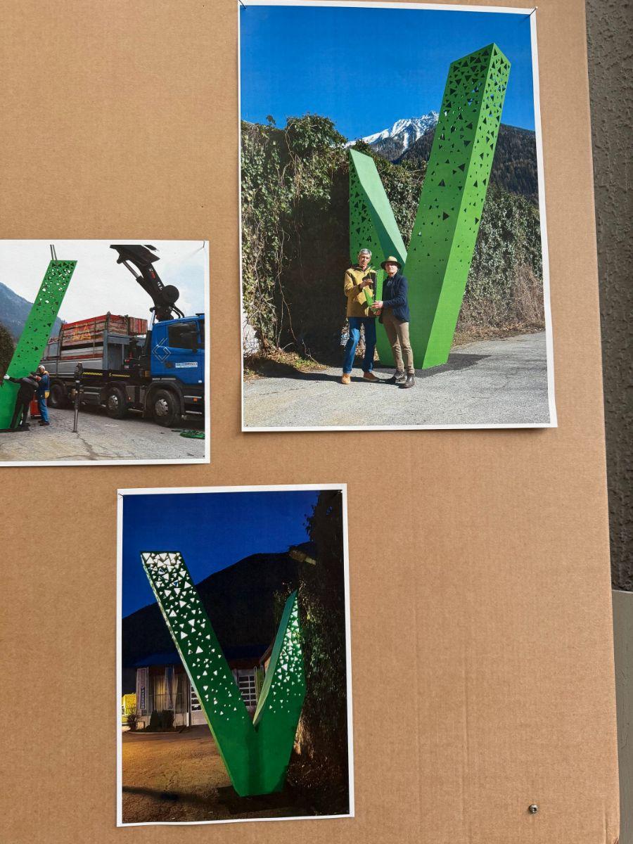
The sculpture is based on the letter “W”, the initial of the Winkler family name. What makes it remarkable is its design: from a distance, the work appears as a single green “V” emerging from the ivy-covered wall of the production hall. Only when viewed up close does the observer mentally complete the shape into a full “W”, which seems to extend through the façade and into the interior of the building. In this way, the sculpture creates a visual connection between the company, the building, and the family’s history.
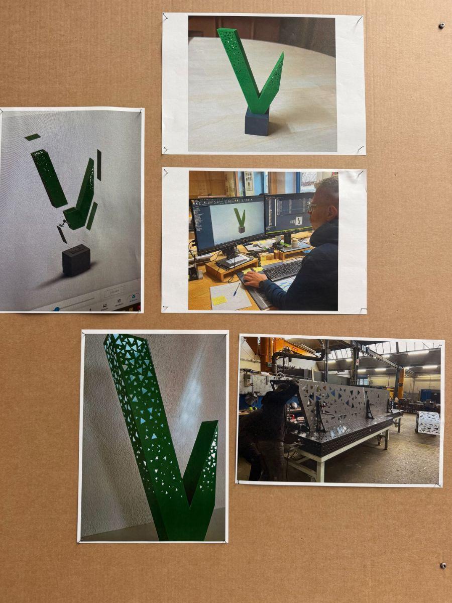
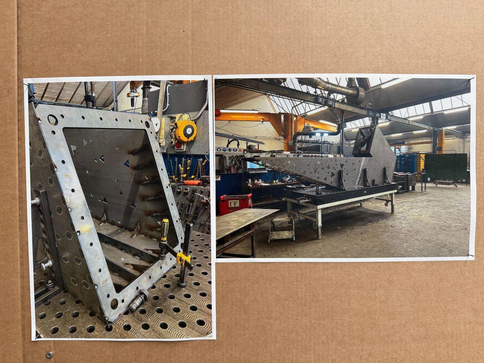
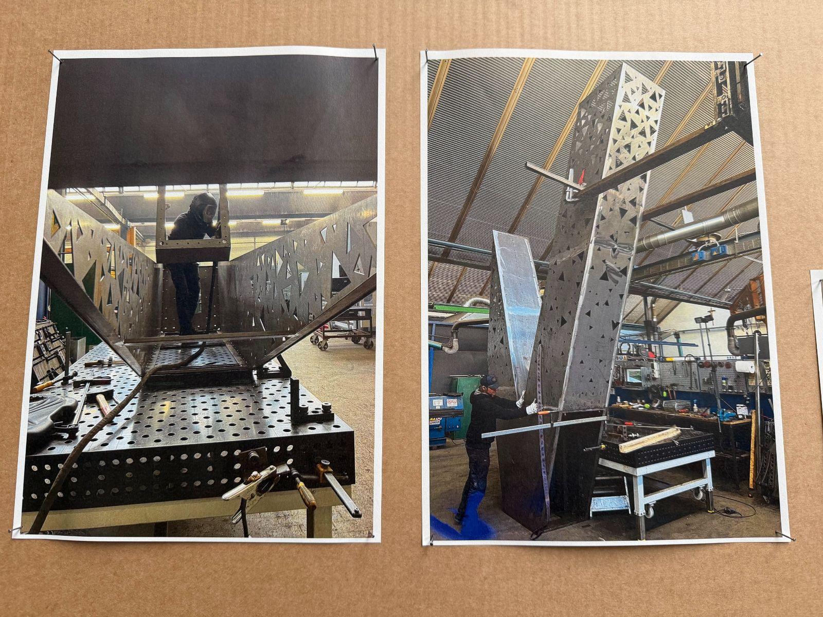
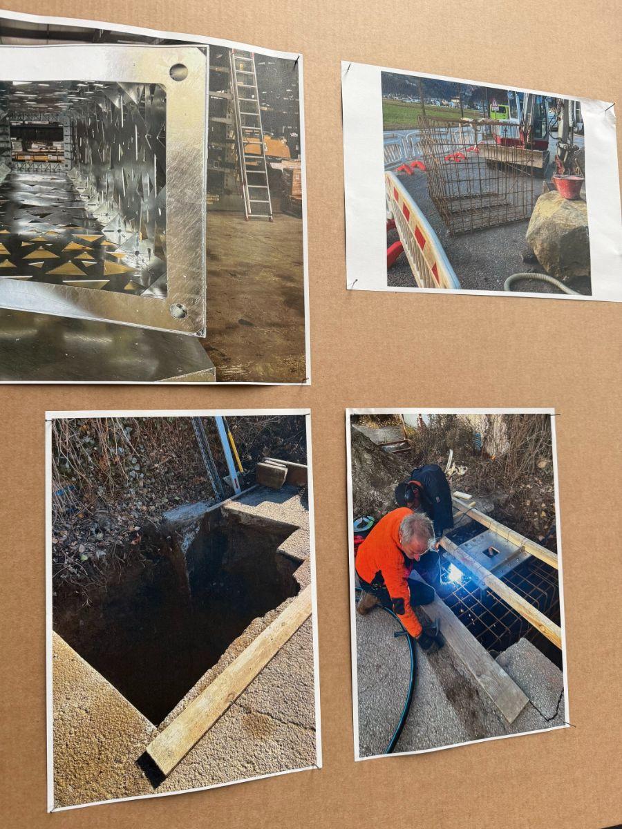
Standing over five meters high, the sculpture has a monumental presence. At the same time, its massiveness is softened by 492 cut-out triangles. This number was deliberately chosen: the sum of its digits equals six, symbolically referencing the company’s 60th anniversary. At night, the sculpture is illuminated from within, making the geometric openings particularly striking.
Why "JEP"?
The sculpture was given the name “Jep”. The term originates from traditional clicking sounds still used in the local dialect, while also appearing in contemporary youth language. By giving the sculpture a name, the artists elevate it to the status of an independent personality with its own character. The author even suggests that it could become a local meeting point in the future—people might simply say, “Let’s meet at Jep.”
Connecting Art, Craftsmanship, and Corporate History
A central idea in Heinrich Schwazer’s text is that the sculpture was not placed in front of the building as a decorative afterthought. Instead, it grows directly out of the company’s history. The “W” refers to the founding family and therefore to the identity of the business itself. At the same time, the sculpture was produced using materials and expertise that are part of euroform w’s own manufacturing processes. It is therefore not only a work of art, but also an expression of the company’s craftsmanship and material know-how.
Furthermore, the project sends a strong message to employees, customers, and visitors: the company consciously invests in an inspiring environment and considers design an essential part of its corporate culture.
Letters as an Art Form
In the second part of his contribution, Heinrich Schwazer places the sculpture within an art-historical context. He asks why a single letter can function as a work of art. To answer this, he points to a long tradition: already in the Middle Ages, elaborately decorated initials were used to merge text and image. During the twentieth century, artists went further, treating letters not only as carriers of language but also as independent visual and sculptural forms.
As a famous example, the author mentions Robert Indiana’s iconic “LOVE” sculpture in New York. Within this tradition, he sees the work of Steger and Feichter as a letter that transcends its linguistic function and becomes an autonomous artistic object.

Heinrich Schwazer’s Conclusion
The renowned South Tyrolean art critic considers the sculpture particularly successful because it does not appear as a decorative element added afterward. Instead, it emerges organically from euroform w’s history, materials, and identity. The work combines family heritage, corporate values, craftsmanship, architecture, and art into a memorable landmark. His concluding interpretation is that “Jep” is, in a sense, an “inhabited initial” — a letter endowed with character, history, and a unique presence in public space.
Latest posts
-
16-06-2026
-
04-06-2026
-
20-04-2026